

Gruppo Campari Print Campaign
—
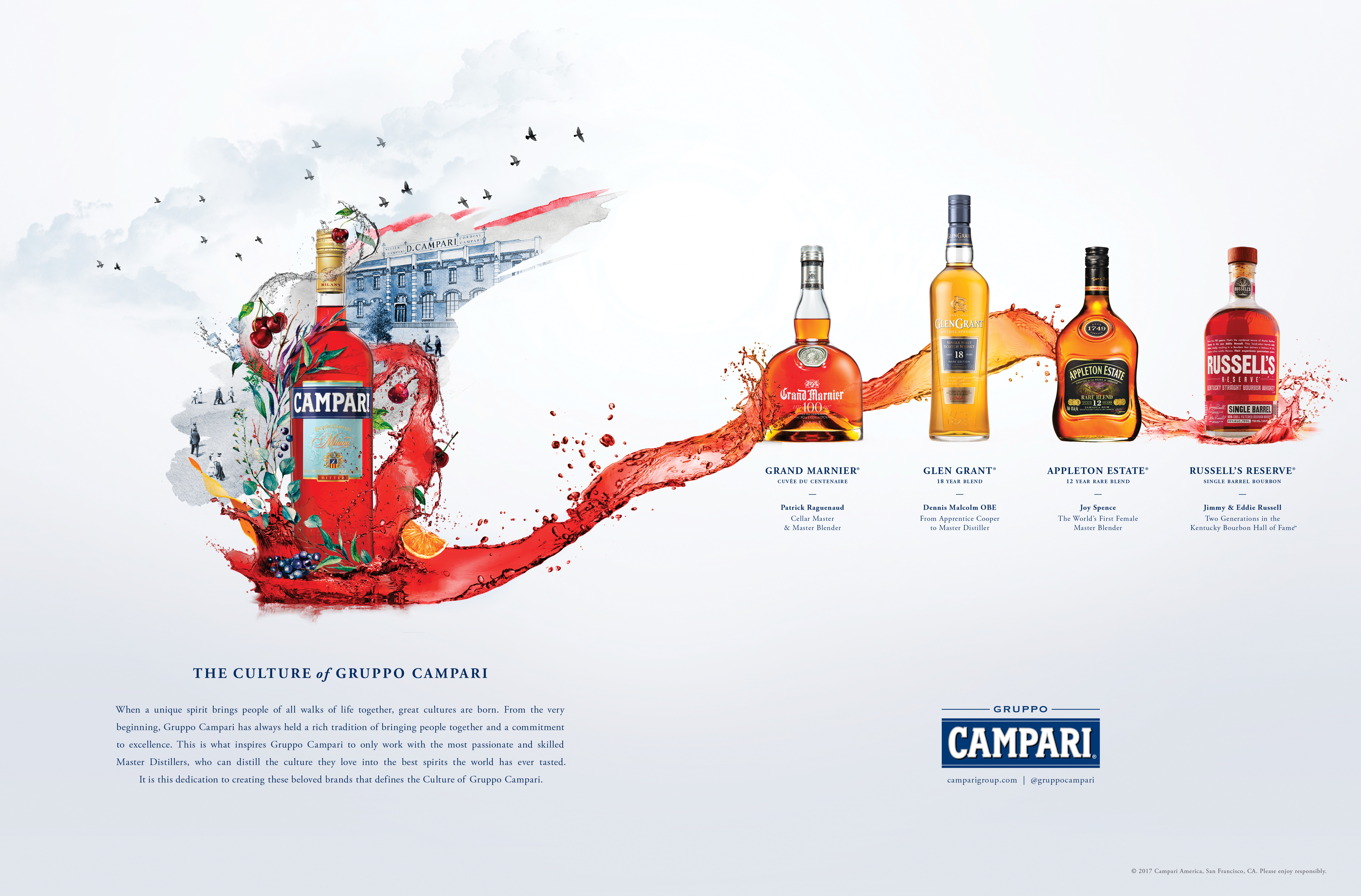
For the first time, Gruppo Campari wanted to advertise their portfolio of premium products. At the heart of these spirits are Master Distillers. Traditionally, Campari has always created advertising strongly rooted in the arts. To build on this tradition, we created a visual world that gave a glimpse into the Master Distillers’ passion and how they infuse the essence of their culture and country of origin into the luxury spirits that they bottle. It is their dedication to creating these beloved brands that defines the Culture of Gruppo Campari.What was very important in the execution was that it allowed for the specific personality and experience of each brand to shine through in the details. But together, the series creates a unified family of brands.
The print ads below appeared in Cigar Aficionado and Wine Spectator Magazines.
Role — Art Director
Campaign concept and worked closely with illustrators and copywriter to concept and craft the final product.
ECD — Florent Imbert
Head of Art & Design — Aaron Padin
Senior Copywriter — Christopher Phillips
Art Director — Emely Perez
Ilustrators — Rodrigo Pinheiro & Rebecca Honda from Paste in Place Studio
Portfolio Spread
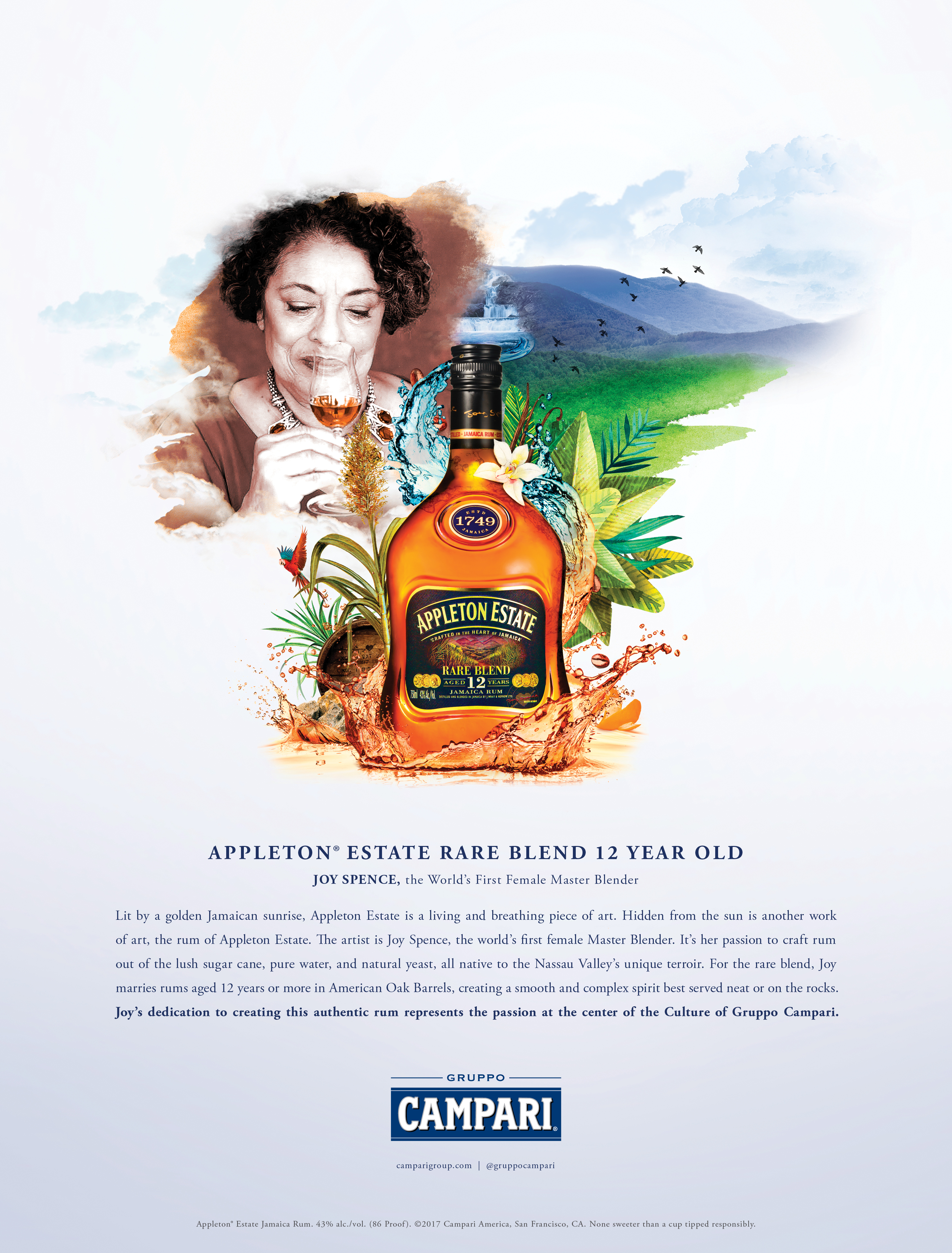
Appleton Estate Rum Rare Blend 12 Year Old
As Joy Spence, the world's first female Master Distiller oversees the distillation process, the home of this rich rum, Jamaica, comes to life behind the bottle. 12 birds fly past the island's famous blue mountains where we see a waterfall as the source of the liquid that flows down and become the rich oak color of the rum. Around it are visuals that represent its aroma and plants from the Nassau Valley.
Glen Grant 18 Year Single Malt
As Dennis Malcolm smells the whisky he oversees, he is surrounded by the aging barrels and tall-neck stills used during the distillation process. The Glen Grant distillery stands proudly to the right of the bottle, surrounded by lush Victorian gardens. The Spey river flows water from the Scottish Highlands toward the foreground where it transitions into the color of the spirit.

Russell's Reserve Single Barrel Bourbon
As two generations of the Kentucky Bourbon Hall of Fame stand side by side, the Kentucky River, which is the water source, flows toward the foreground transitioning into the color of the bourbon. Overhead, there is an idyllic blue sky over fertile land subtly covered with the Kentucky state flower, the Goldenrod. The distillery sits on the peak of a hill, overlooking two bridges in the background. A wild turkey sits amongst the brush. Ingredients are placed on either side of a single barrel which is subtly branded with the Wild Turkey logo.

Grand Marnier Cuvée Du Centenaire
Grand Marnier prides itself in having two very different ingredients come together to form their product, fine French cognac which is made from grapes, and exotic bitter oranges with green peels. We represent this by having two streams of liquid splashing upward from either side of the bottle. Observing the quality of the ingredients is Master Blender Patrick Raguenaud. The Château de Bourg-Charente sits in the background with open doors.

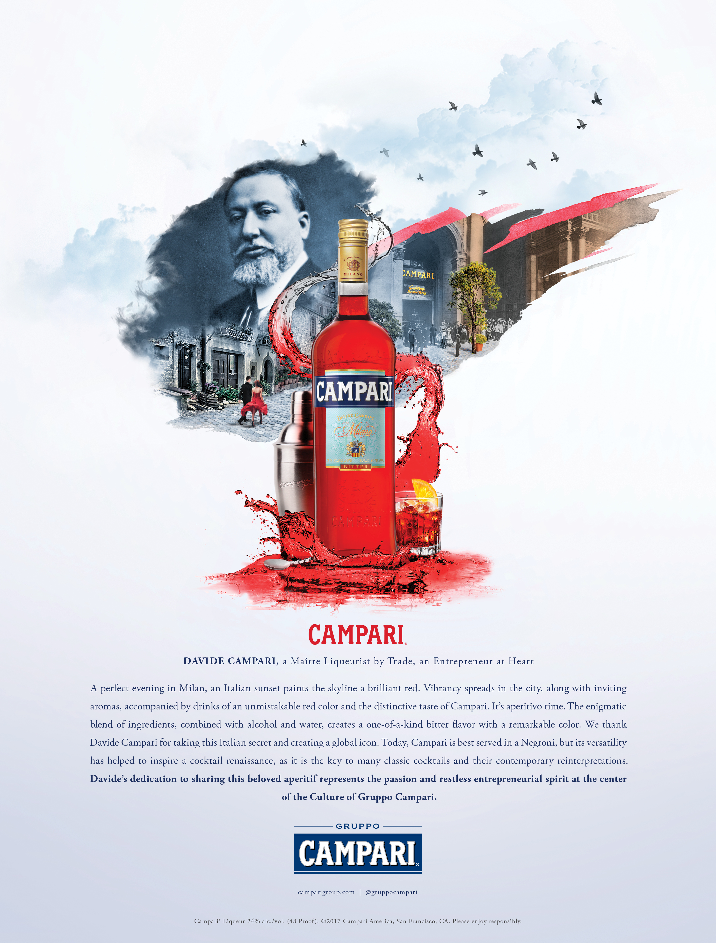
Campari
For such an iconic brand as Campari, we needed to showcase the bar where it went from an Italian secret to a global icon. We wanted to position the product as a bridge from the future to the past. On the left side of the bottle we feature a modern scene: a man in a black suit and a woman in a red dress being drawn towards a vintage scene of the Galleria. To the right of the bottle we feature the Galleria in its heyday, buzzing with clientele.
Print Singles Side by Side